We’re out of town, so I thought I’d take this week to share with you some of the tips and tricks I use on PicMonkey to make this blog prettier. This is installment one of four. PicMonkey is an online photo editing and design site. The basic version
is free, but you can also choose a yearly subscription to “Royale” that
gets you more options, and no ads. This is not a sponsored post, I just like PicMonkey. This post contains affiliate links.
I enjoy photography, but I’m an amateur.
I have a camera I like
, but it’s not high end, and I don’t know how to shoot in manual. I don’t have photoshop or any professional editing software.
I try to follow the basic photography rules of using natural light, creating interesting angles and perspectives, and not always centering the subject of the photo.
And, when that’s not enough, I head over to PicMonkey and try to fix it there.
I’ll walk you through what I do.
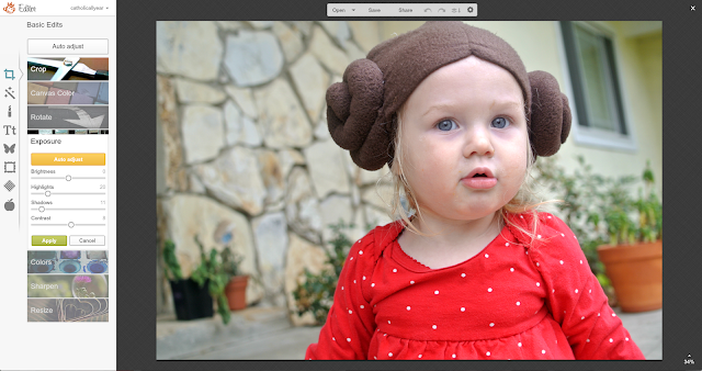
Here’s a photo of Lulu on Star Wars Day. It is, clearly, awesome. But a bit bland somehow.
I go to the PicMonkey site, and open the photo.
But, since I am a royale member, I’m going to keep going.
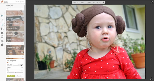
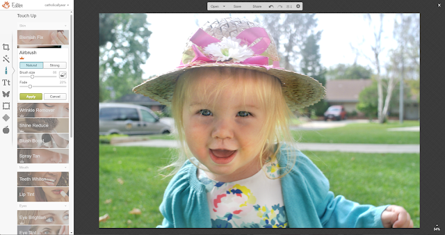
From the Touch Up menu, I select Eye Brighten, adjust the size of the brush, and brighten up the eyes. All of a sudden, her eyes become the focus of the photo. I’ll also sometimes make VERY subtle use of the blush and lip tint, just to bring a little more color to the photo. Obviously, it would look terrible if it was noticeable.
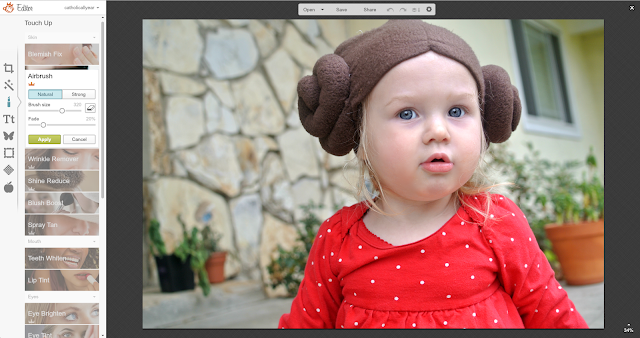
Again, we could be done. But, in this case, I also went to Airbrush, to get rid of some of the crud that’s always all over my kids’ faces. Snot crud around the nose, eye crud around the eyes, food crud around the mouth, all gently fades away.
And voila! It looks like I’m a better photographer than I am, but doesn’t have an obvious filter look (although PicMonkey does have all of those filters) or a super-airbrushed unnatural look.
If you’re looking for a one click fix, you can always apply a filter instead of doing all the tweaking yourself.
I like Orton, it’s the closest to the look I try to achieve on my own, but I still don’t think it’s quite as good as doing it yourself.
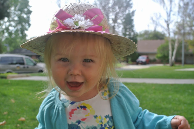
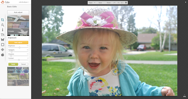
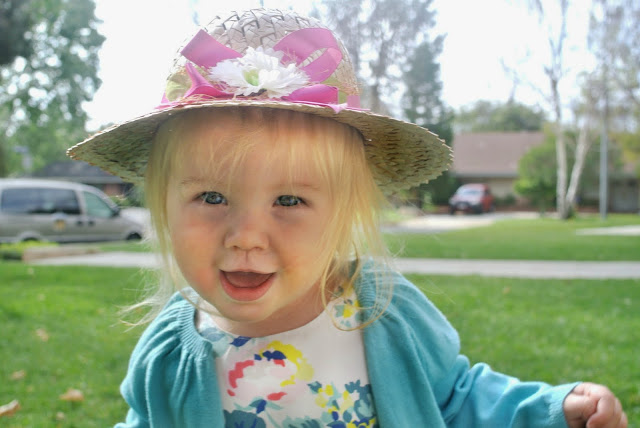
Here’s another example, from Easter. I like this photo, but the lighting is not good.
First, I adjusted the exposure.
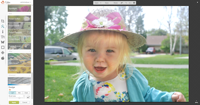
Then, because her face was still a bit dark, I went to the Effects menu, and scrolled all the way down to Dodge. I selected Light, and used the brush to lighten the photo just on Lulu’s face and the bow of the hat.
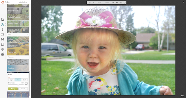
Then I went to Burn to darken her sweater and the underside of the hat.
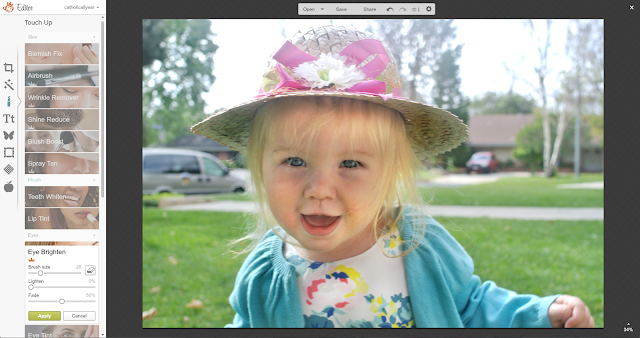
Then, Eye Brighten from the Touch Up menu.
And a little Airbrush to remove face crud.
And, done.
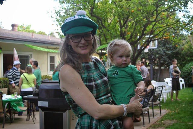
Finally, just to show you. Let’s look at a bad photo. Our faces are completely shadowed, we blend into the background. It’s just not a great shot.
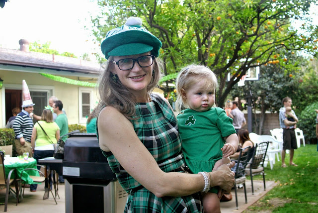
And it never will be. But using all the same steps, we can adjust it to the point that it becomes useable.
The PicMonkey Blog has some great video tutorials on rescuing and improving your photos.







Thanks for sharing this. I use pic monkey but have never taken advantage of all of these options.
This is so helpful! I just started playing around with Dodge and Burn – it is so fun. I am looking forward to the rest of your series.
I love the Orton filter. I usually apply that to every picture after I tweak the basics, just because I like the soft and vibrant effect so much. I do turn down the intensity quite a bit. Otherwise it's too soft and blown out.
Thanks for sharing! I think even I could do this – and I'm an absolute technological idiot!
Thanks for sharing! I didn't realize I could do so much with it. I also like that you showed Cross Process. I don't like this filter. It looks like some of my old photos from the 80's after the images started to age. I guess if you didn't grow up thinking, "I wish my colors were more true" (Like I did) you might think it's a cool filter.
I did learn a lot from this really quick tutorial, so thanks! I will be using Pic Monkey better now.
Thanks for sharing your secrets!!!
And here I thought you were just awesome at photography! 😉 To be honest, I've tried PicMonkey before and really couldn't get the hang of it. It felt bulky, and was frustrating to do/undo some of the features. Maybe the paid version is easier to use…
It has felt pretty intuitive to me. But if you don't like the free version, you probably wouldn't like the paid version either. It's not different, it just gives you more options.