We’re out of town, so I thought I’d take this week to share with you some of the tips and tricks I use on PicMonkey to make this blog prettier. This is installment four of four, also see Lesson 1: Using PicMoney to Make Good Photos Great and Bad Photos Pretty Good, Lesson 2: Don’t Make These Mistakes Using PicMonkey to Make Shareable Images, and Lesson 3: Using PicMonkey to Create Graphic Designs and Pinnable Images. PicMonkey is an online photo editing and design site. The basic version is free, but you can also choose a yearly subscription to “Royale” that gets you more options, and no ads. This is not a sponsored post, I just like PicMonkey. This post contains affiliate links.

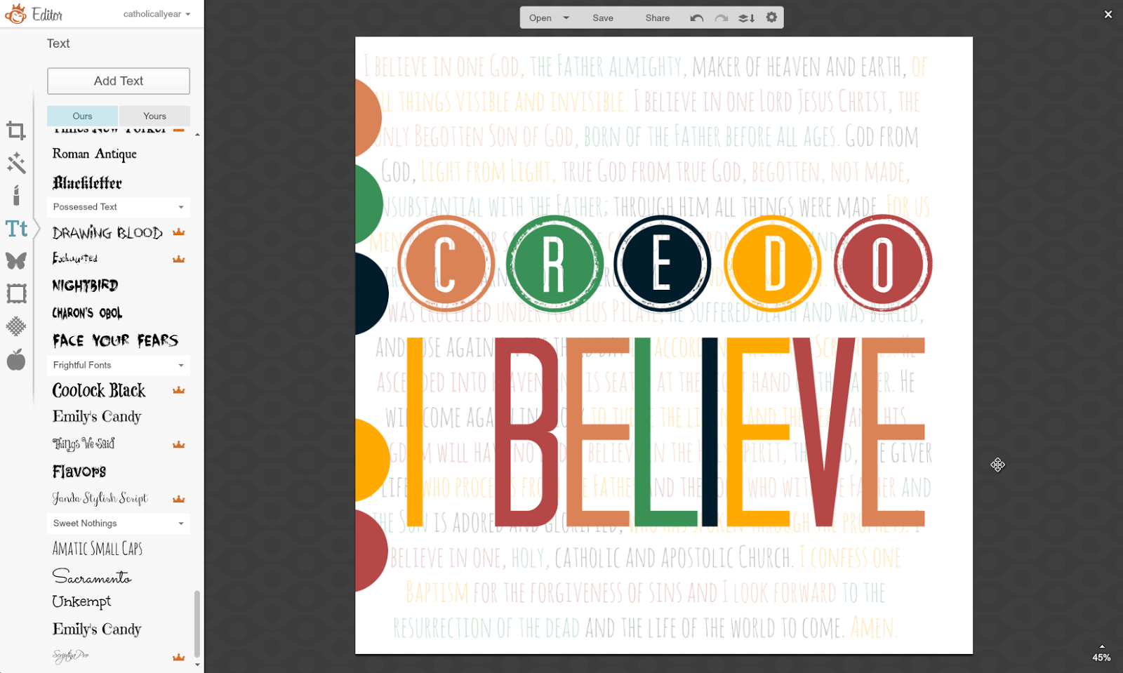
2. I thought I’d have different sections in different fonts and colors. But it looked lame. And wasn’t going to fit.
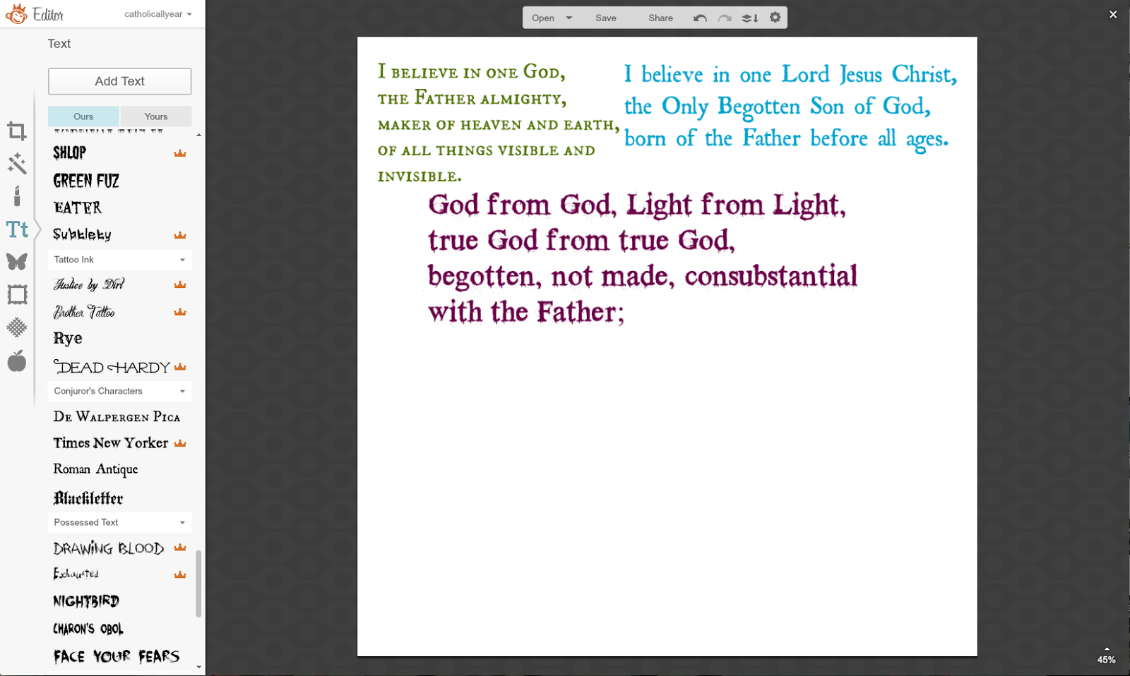
3. So I just did it all in one block and one font.

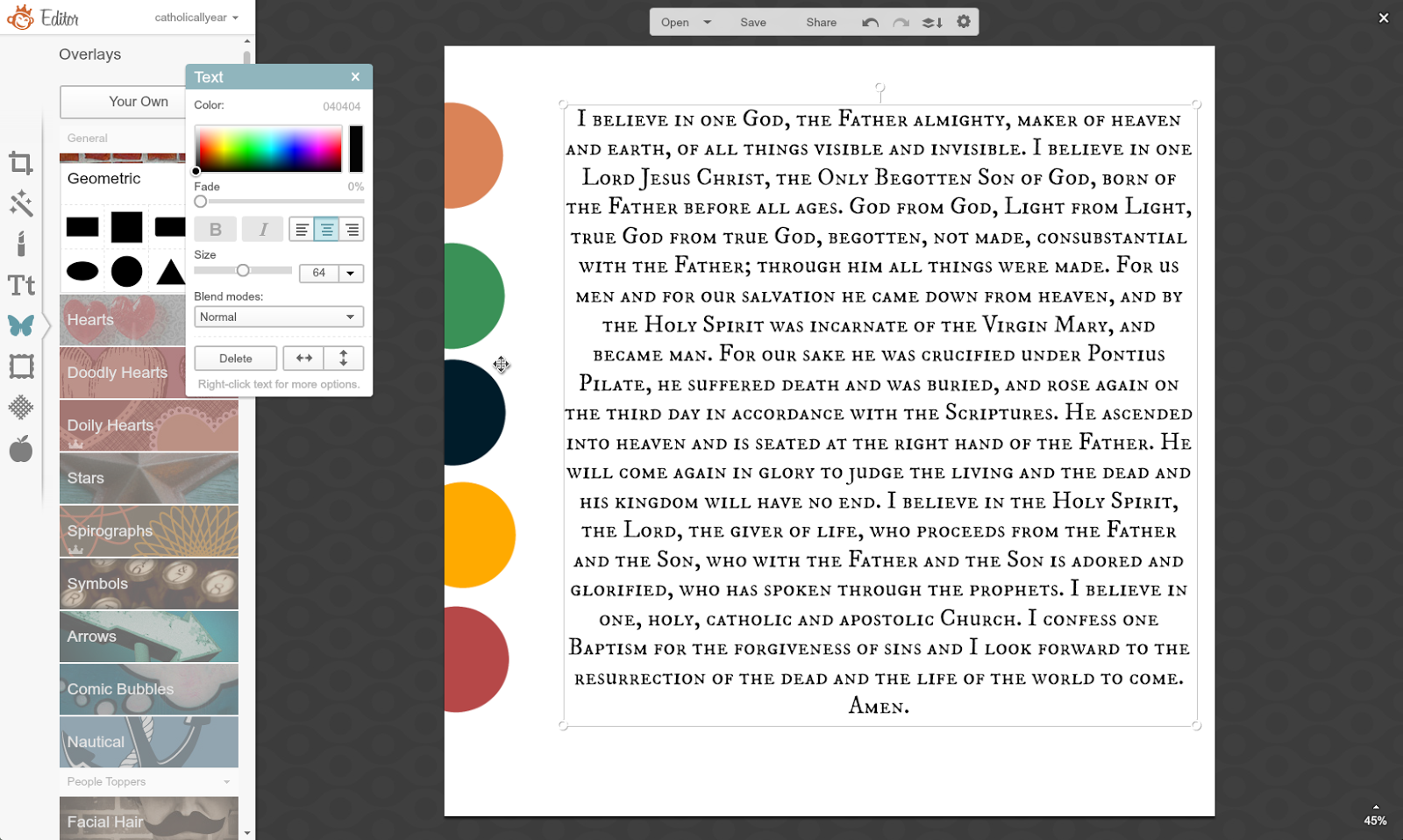
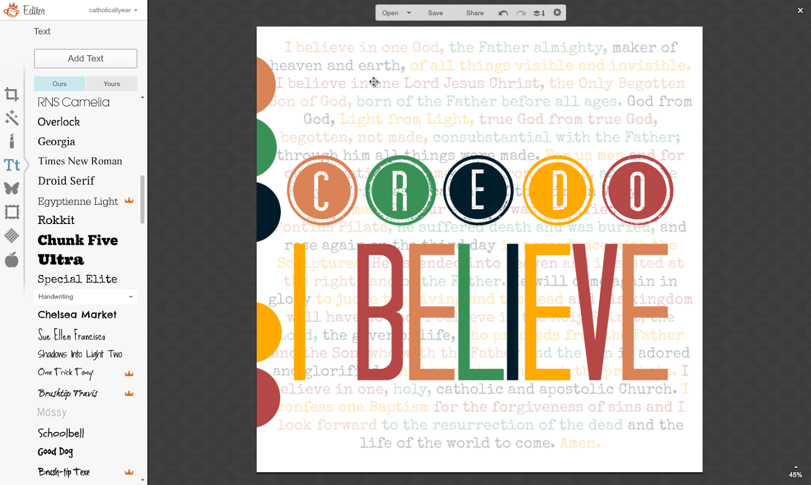
5. I selected little chunks of the text, and using the Eyedropper Tool, selected the color from one of my five color spots. I went through the whole text, changing the text colors bit by bit in order of my color spots.

6. I moved my color spots over off of my image, but they are still there (you can see the square outline there of the orange one) because I’m going to pull them back over and use them again later. And I faded my text to create a more subtle background.
7. Then I made my foreground text. On that little horizontal menu above the image there is an option to “combine all image elements.” If I did that before I started adding the foreground, I wouldn’t have to worry about layers and trying to select which text box I’m working on. But I really, really hate to do it, because then it becomes the permanent background and I can’t fiddle with it any more. So I pretty much never do that. What I do instead, is drag my foreground text boxes out over the edge of the image, so I can go out there and easily grab the edge of the text box I want to edit.

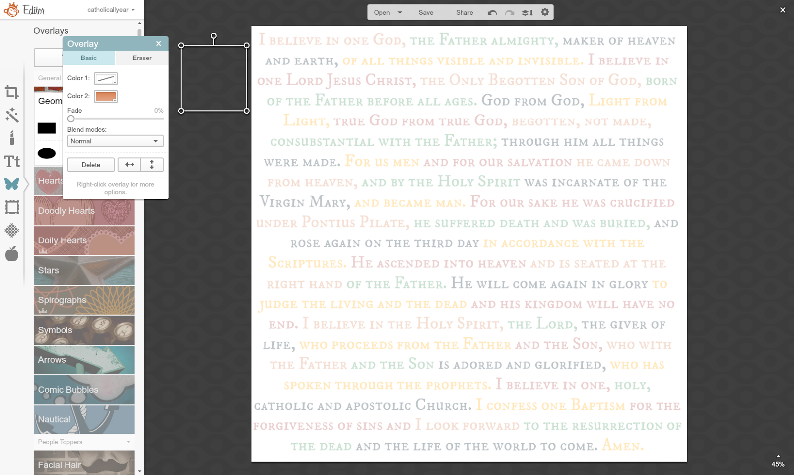
8. I changed the colors of the foreground text. More fiddling.
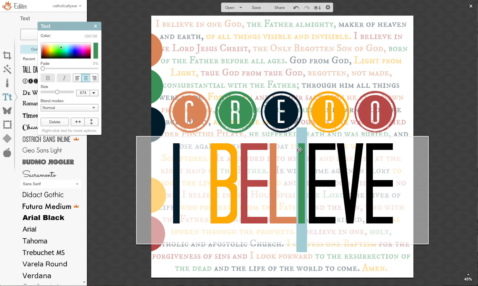
9. Then I wasn’t loving the background font and started messing with it. This one was too hard to see.
10. Too round.
11. Too busy.

12. Close but no.
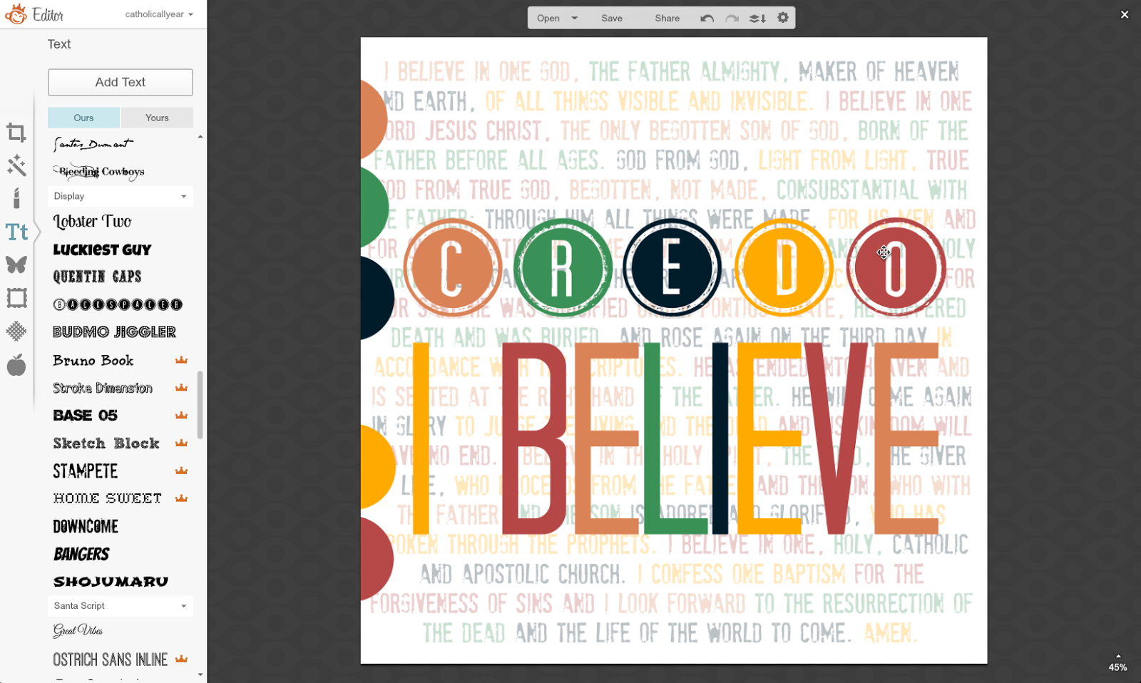
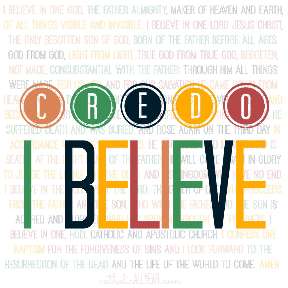
image and save it to your computer for your own personal use. You may
print the images and / or upload them and have prints made for your
personal use or to give as gifts. (These are sized for 8×10 or square but will
print well much bigger.) You may use my images on your blog, just please
link back to my blog. If you would like to sell my images, please
contact me first. To request a custom printable, visit my Etsy shop here.
For LOTS MORE free printable prayers, check out my Pinterest board.
If you’d like to get the html code to put the button on your blog sidebar, go to the bottom of this post.
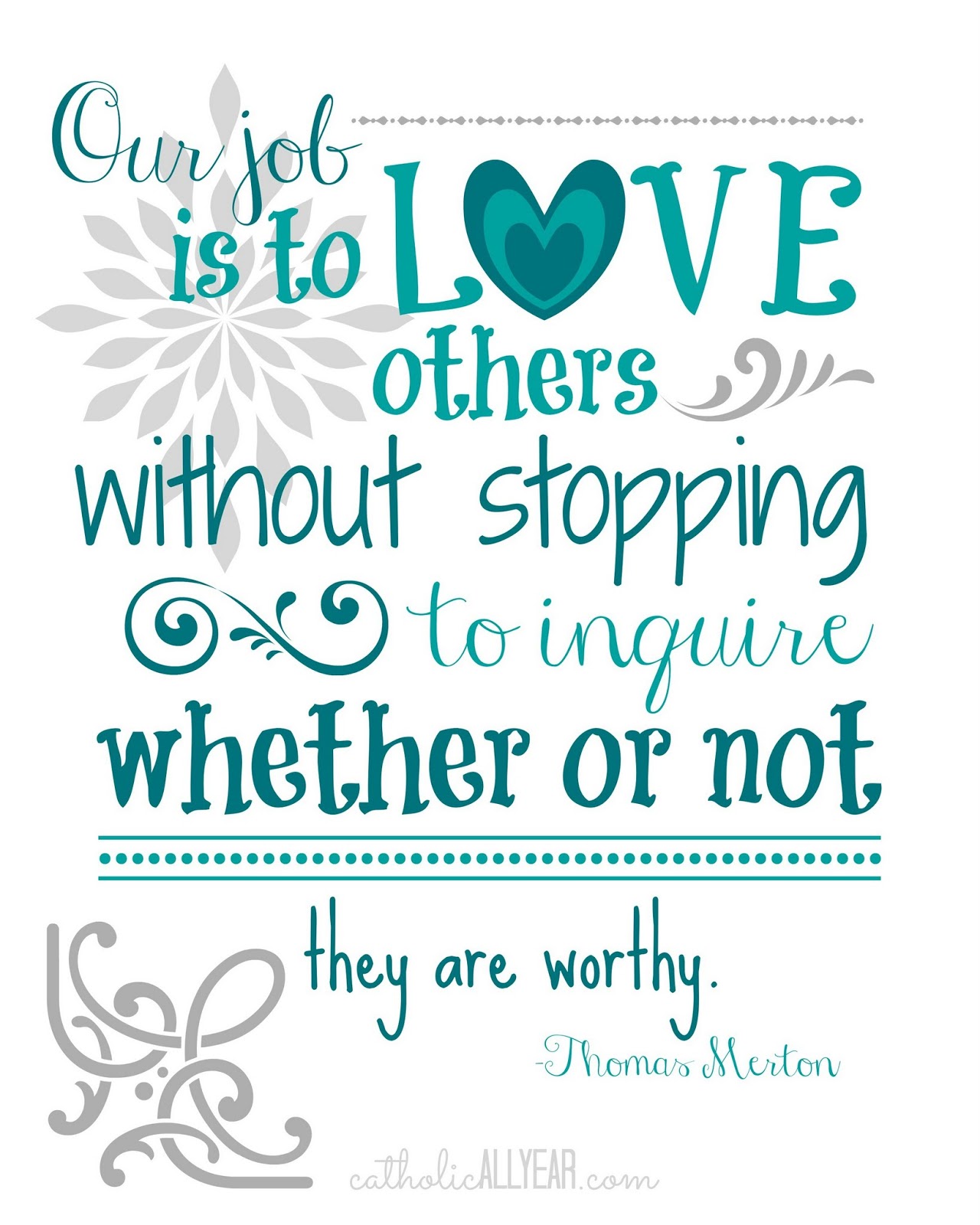
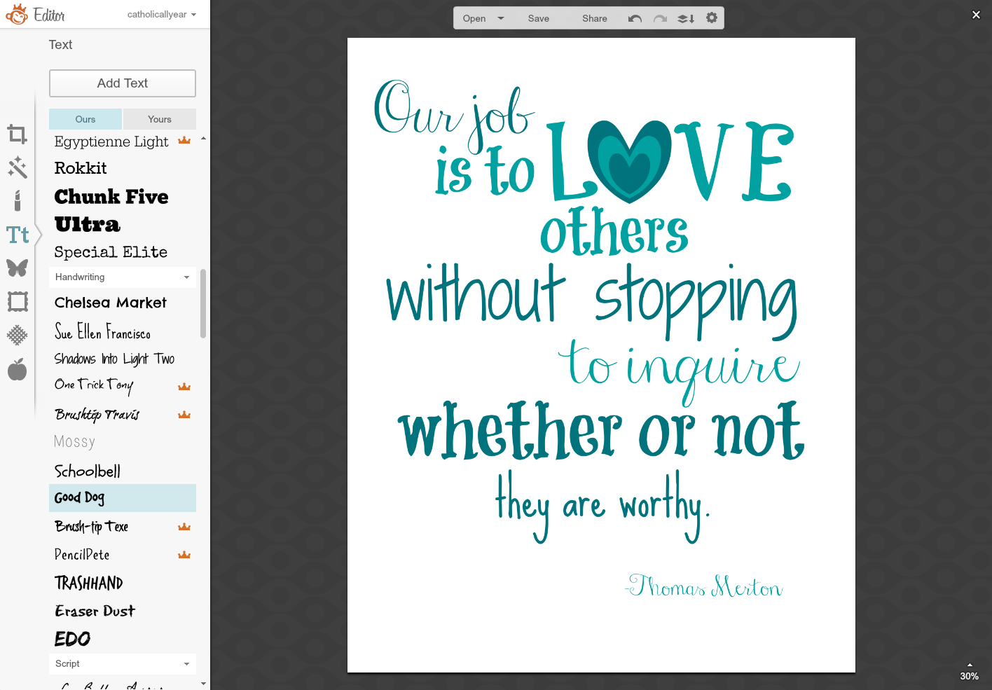
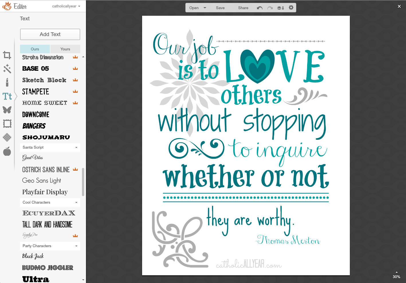
This one was a request from reader Theresa M, whose older brother is a novice entering the Abbey where Thomas Merton lived and is buried. Pretty. Awesome. She wanted it to look kinda like the Grace Before and After Meals prints I made, but be in teal or turquoise on a light background.
1. As always, the first step is to put the text of the quote on there and start messing about with it.
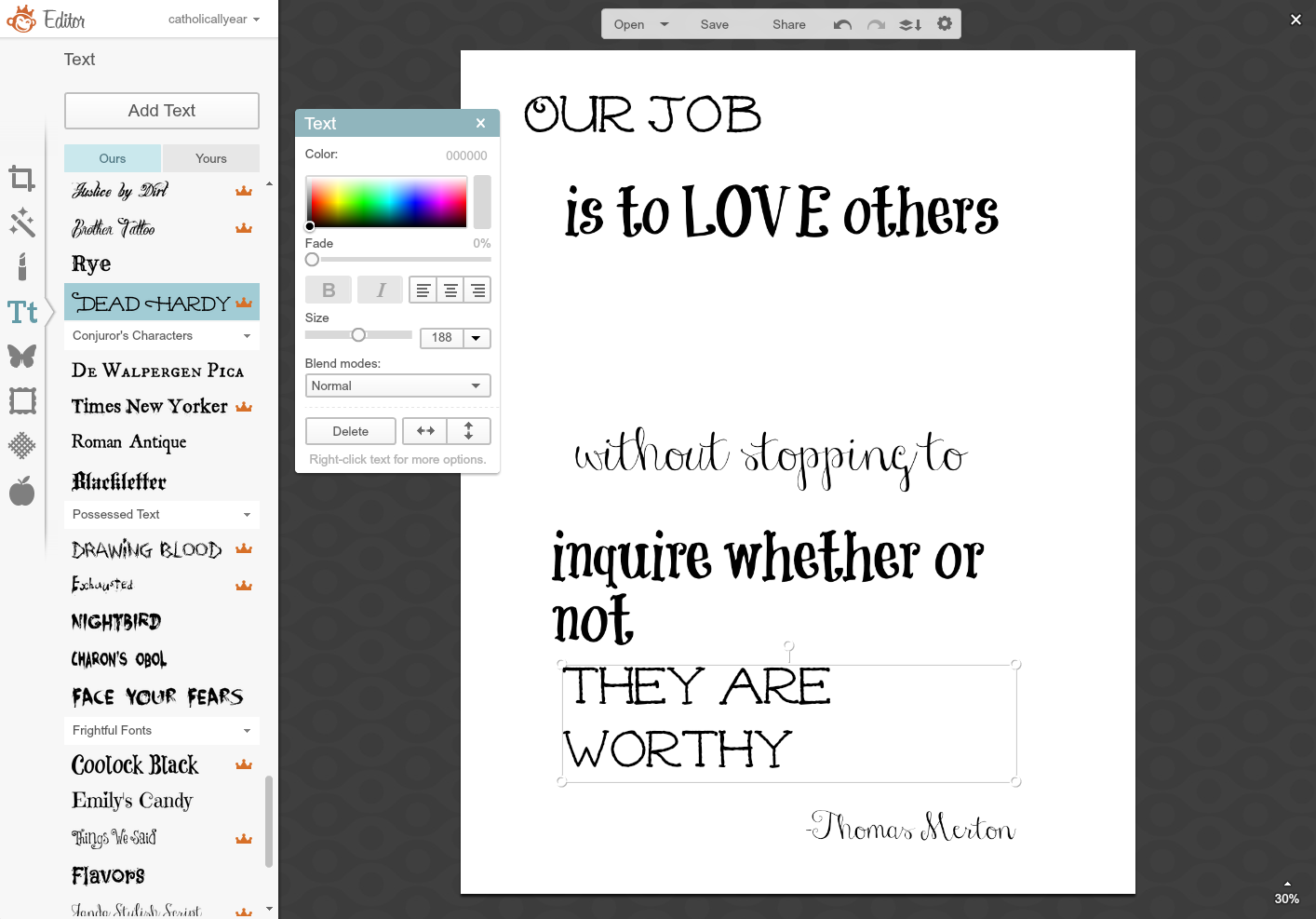
2. I kinda can’t help myself with the making the “o” in “love” a heart instead. It’s how I roll.
3. I just kept changing the fonts around until I liked it.
4. Then I started messing with the colors.
5. And messing.

6. And messing. Until it looked right.
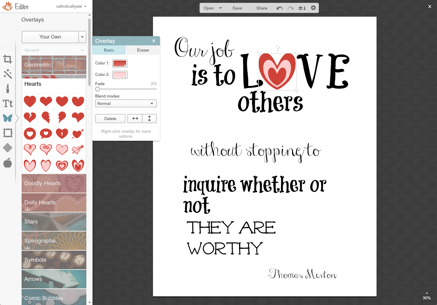
7. When a quote or prayer doesn’t have enough words to fill the space, I add Overlays.
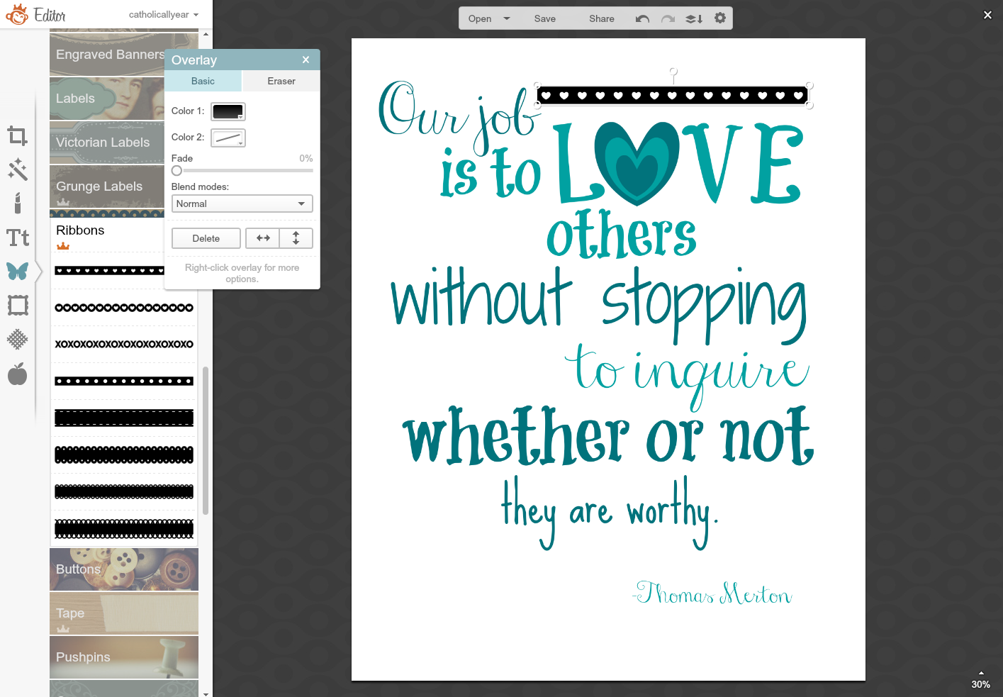
8. And, if necessary, right click on them to open up this little menu, which allows me to Send to Back, so it’s behind the text.
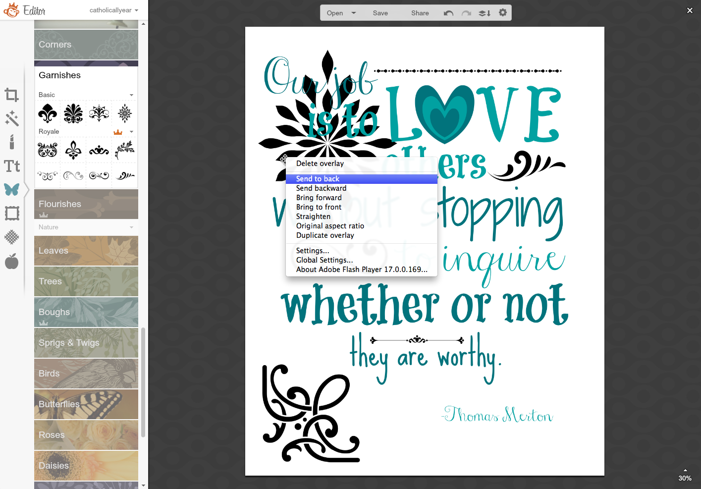
9. I selected colors for the overlays, using the Eyedropper Tool when I wanted to match colors in other parts of the image..
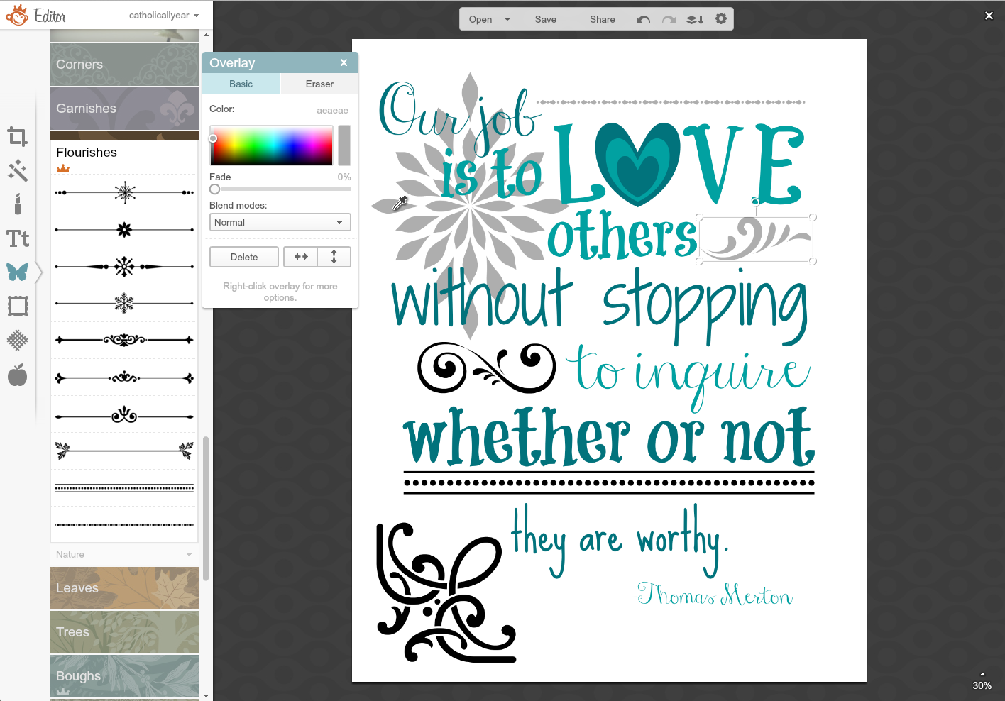
10. I used the fade bar on some of the overlays, to make sure the text was visible. And this one I liked, so I saved it.
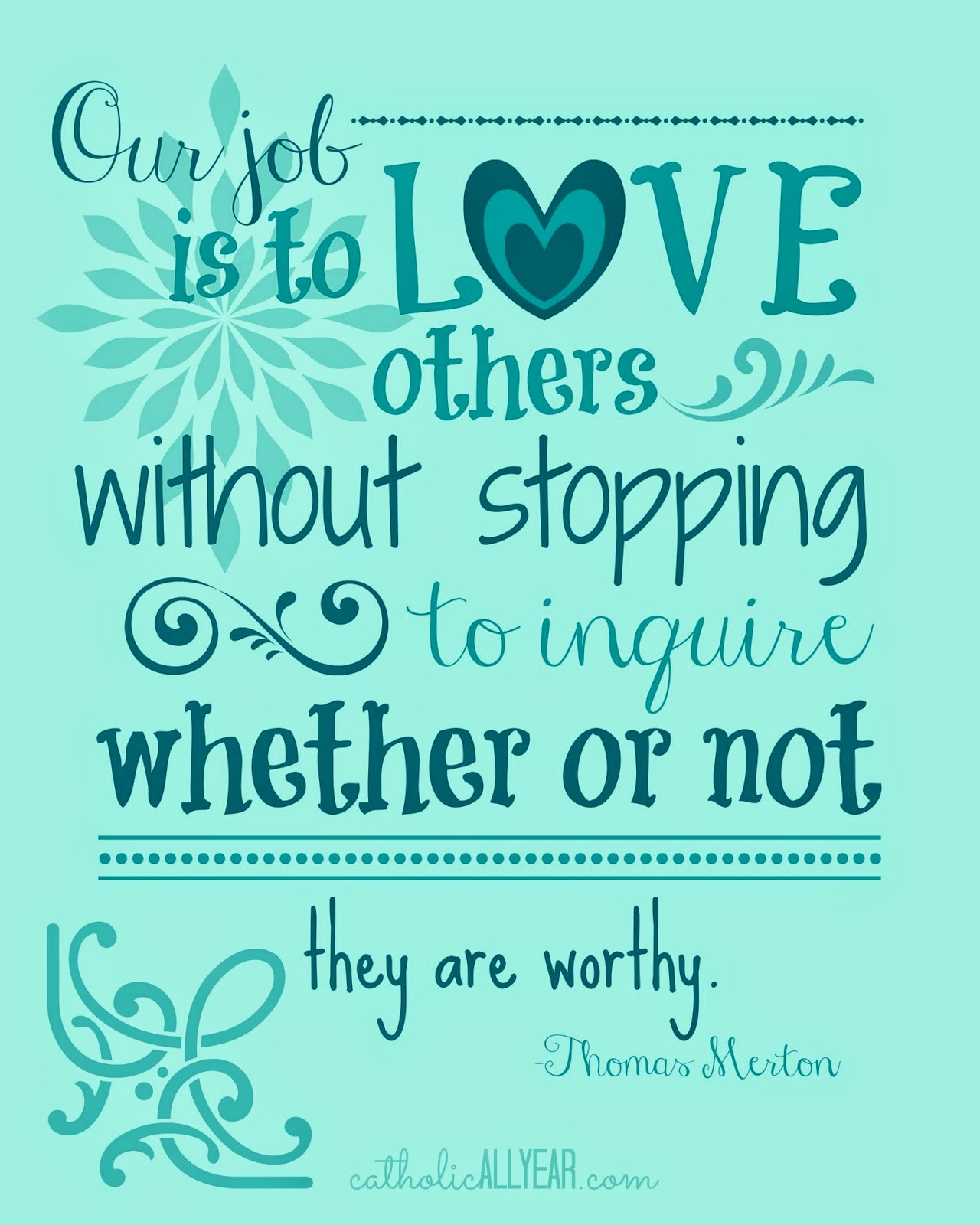
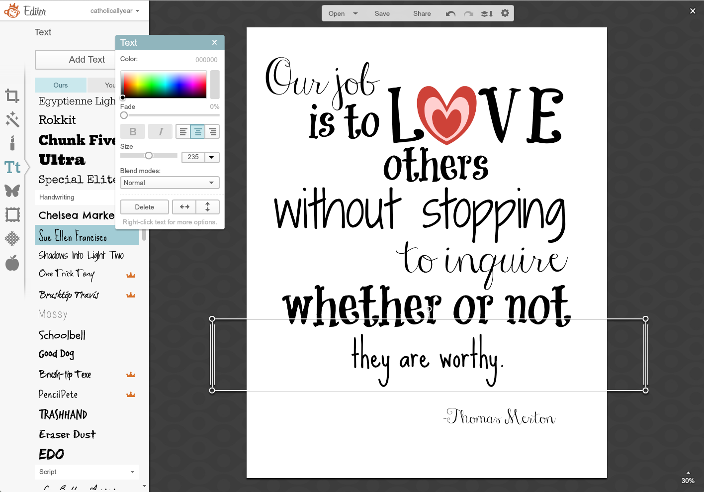
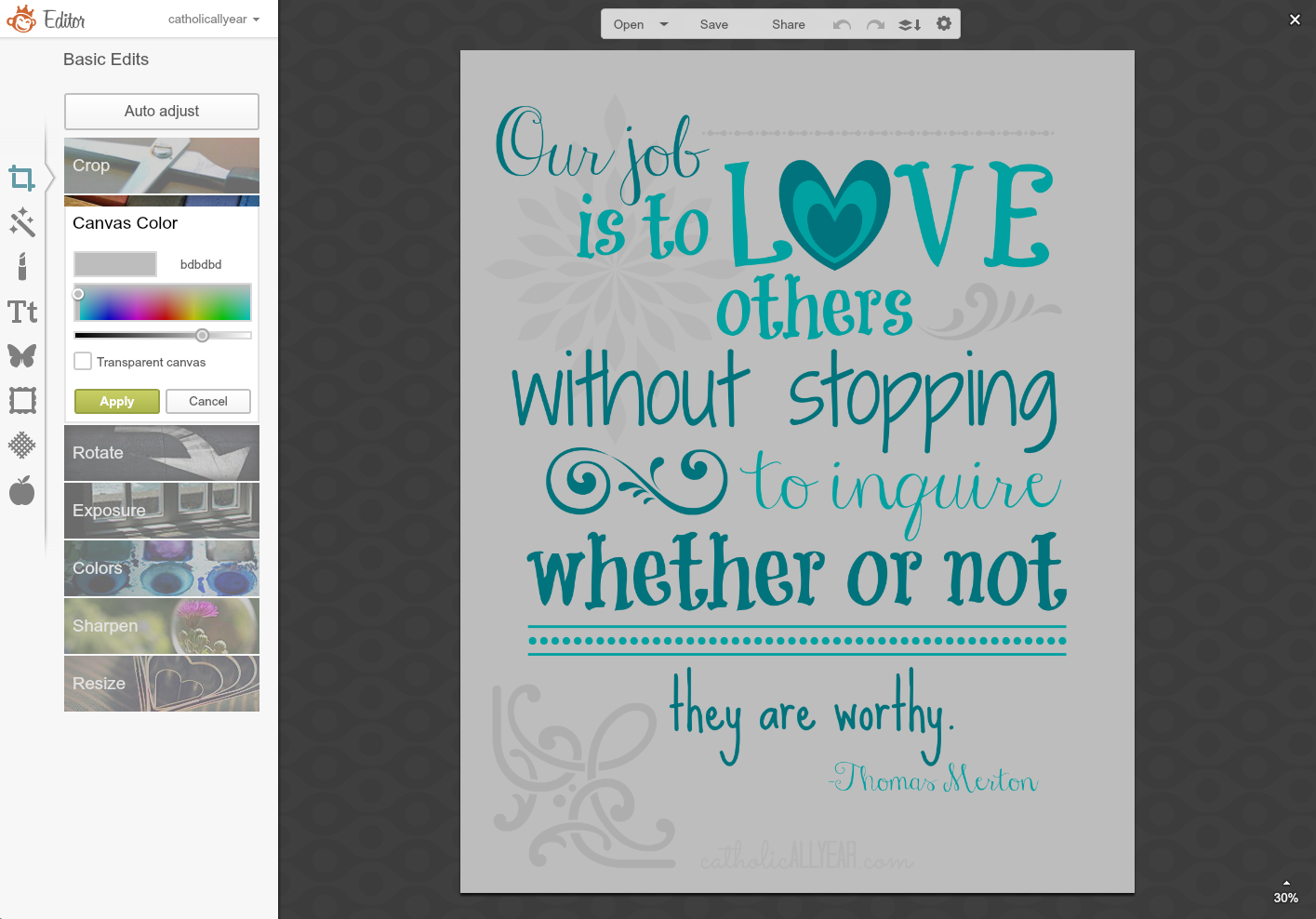
11. I wanted to have another version with a colored background, so once it was saved, I went to the Basic Edits Menu, selected Canvas Color, and tried to find a color I liked. NOT this one.
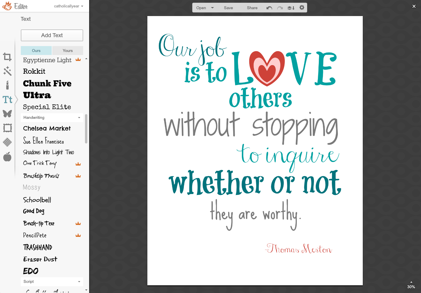
12. This one I liked. But then I wasn’t feeling the gray in the overlays.
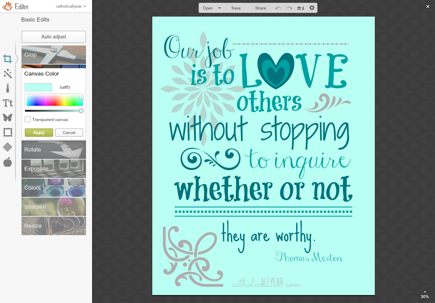
13. So, using the Eyedropper tool, I made them the blues of the text, and then faded them down to different levels. For variety. And then I saved this one.

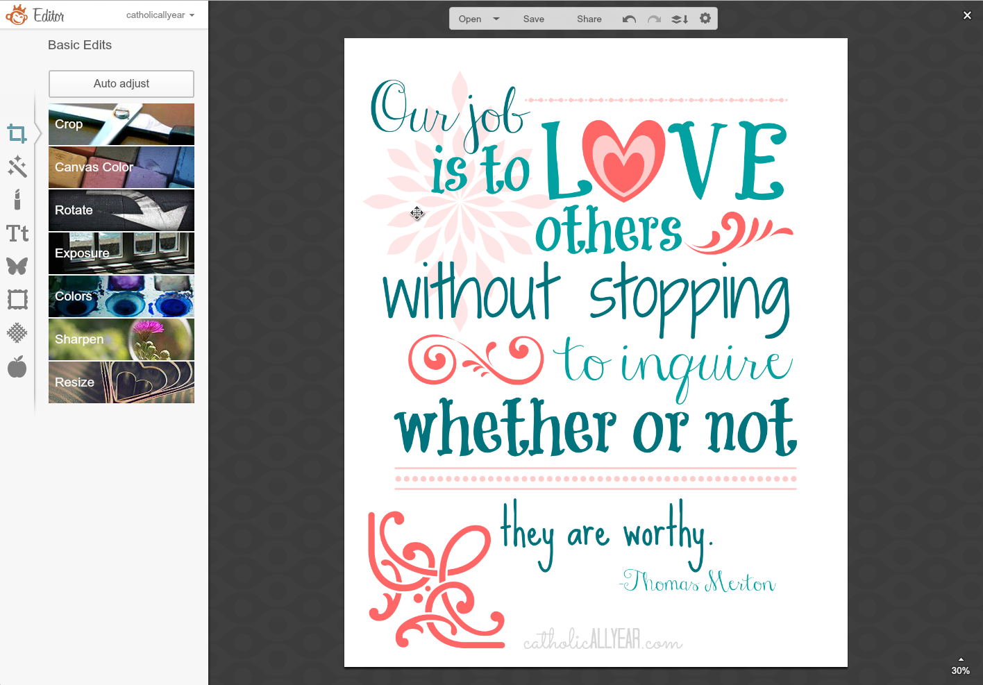
14. But then I was feeling like all that love really needed a little pink. So I used the little “undo” arrow in the horizontal menu over the image and backed it up until the canvas was white again. I started clicking on overlays and making them shades of pink, to give me one more version. And I saved that one, too.
And here they are: