We’re out of town, so I thought I’d take this week to share with you some of the tips and tricks I use on PicMonkey to make this blog prettier. This is installment two of four, see Lesson 1: Using PicMoney to Make Good Photos Great and Bad Photos Pretty Good. PicMonkey is an online photo editing and design site. The basic version is free, but you can also choose a yearly subscription to “Royale” that gets you more options, and no ads. This is not a sponsored post, I just like PicMonkey. This post contains affiliate links.
I make a lot of shareable images. Which means putting saint quotes or other sayings on a photo, and sharing them on Facebook and the blog. Getting shared on social media is a great way to increase visibility of the blog, and it’s also been an easy way for me to share my love of the saints and of celebrating their feast days.
I make almost all of my shareable images with PicMonkey. (In a pinch, when I can’t get to my desktop, I use an iPad app called Rhonna.) The free version of PicMonkey has tons of great options, but I’ve upgraded to the Royale membership, to get all the bells and whistles with no ads.
I’ve learned some tips and tricks over the past couple of years on how to make readable, visually appealing images, that probably won’t get me sued. I’m going to share how I do it with you today.
And I’m going to do that by sharing with you some mistakes I’ve made, so you can avoid them.
Google image search has made finding a picture of just about anything very, very easy. But, if you want to USE the pictures you find, on your blog or website or Etsy shop or whatever, you’ve got to be careful. Most of those images are copyrighted, and if you use them without permission you are running the risk of getting sued, not to mention wronging a photographer.
There are plenty of cautionary tales out there. Here are two:
Blogger Beware: You CAN Get Sued For Using Photos You Don’t Own on Your Blog
The $8,000 Mistake That All Bloggers Should Beware
Like here:

In this image I used the filter Orton from the Effects Menu, and added Sunglow from the window. I also used an Overlay, to make the text more visible, more on that later.
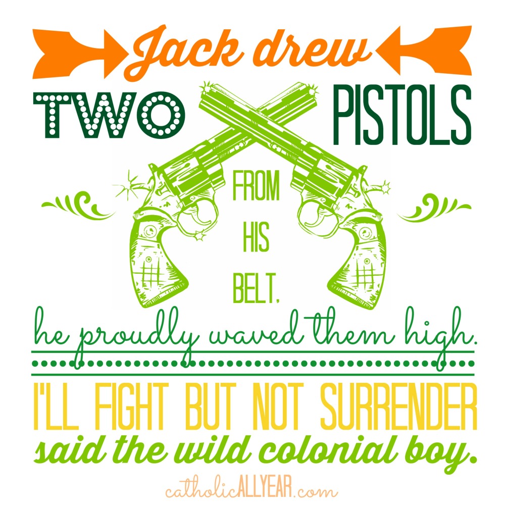
You can also pay a license fee for the right to use a particular image, sometimes it’s as little as a dollar or two per image, for really great photos or cool clipart like these guns:
Or you can find images that are in the public domain.
21 free public domain image websites (use with care)
Or, use Google image search, just use it right:
Find Reusable and Public Domain Images With Google
From the Filters Menu under the Effects Tab, I selected Daguerrotype, then Shiro:
And this engraving is over 95 years old, which means the copyright is expired:
Or don’t use images at all, just make the words pretty. But that’s going to be another post.
Okay, so now we know how to GET the photos. In an earlier post, I showed you how I use PicMonkey to improve the look of photographs. So I’m going to assume all your photos already look amazing. Now, let’s talk about how to put words on there.

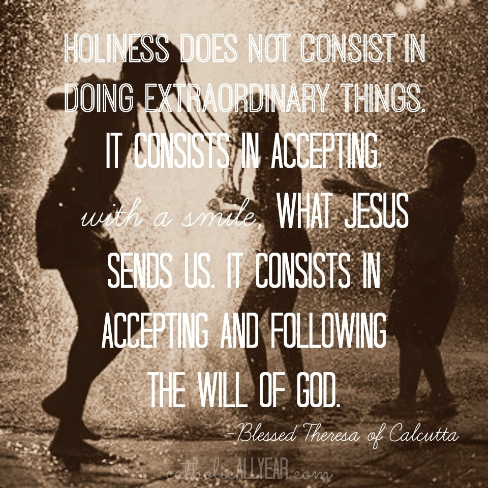
And ended up with this sharable quote image:

Like this. All clean-edged fonts:
From the Effects Menu, I selected Draw. I used the little Eyedropper Tool to select the color of the wall, and used the Draw Effect to get rid of most of the background. Then I added Bokeh Shapes.
Or this. All stamped-look fonts:

I probably use too many different fonts, myself. If you are trying to bring more people to your blog, you want them to be able to recognize an image as your work right away. The best way to do that is to have a consistent look to your shareable images, and only use two to four different fonts.
In PicMonkey, I went to the Filters Menu under the Effects Tab, and selected Daguerrotype, then Shiro. It creates MORE contrast between the background and the text. But I still think this one is kinda hard to see.
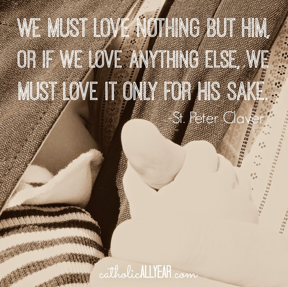
To make the text stand out more, you can put something behind it. From the Overlays Menu, I selected a Label, made it white, Faded it to 50%, and using the Right Click Menu, sent it to the back, behind the text.

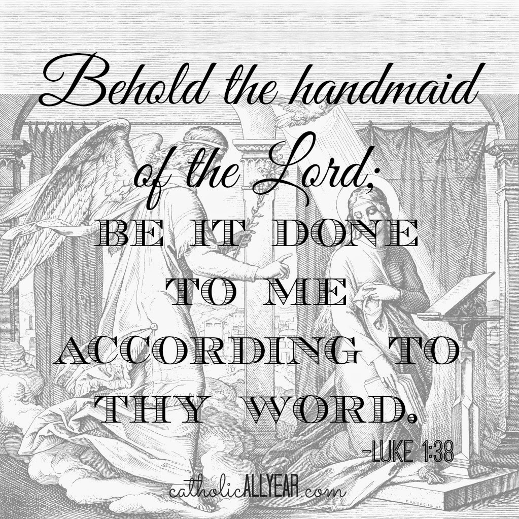
On this image, I did the same thing, but I selected a square from the Shapes Menu, faded it, and stretched it to cover the entire photo.

This is the photo I started with:

I used the Draw Effect from the Effects Menu. Using white, I scrubbed out the background and the extra donkey, then from the Frames Menu, I selected Simple Edge, and kept putting white frames around the edge until I had plenty of room above the donkeys, then I cropped the image square, added the overlay, faded it, and added the text.
A watermark is just a small, often faded logo or text telling everyone that it was YOU who made that image.
I do not watermark all of the photos I put on my blog. Some folks do, it’s a judgement call. Not putting a watermark on the image doesn’t mean you don’t still own it.
I DO, however, watermark all my pinnable or sharable images, so that anyone who likes what they see will know how to find me.
You can just type your name or the name of your blog or organization, make it a reasonable size, fade it, and put it someplace visible yet not distracting. That’s what I do.
You can also use PicMonkey to create a watermark on a transparent background that you can save as a .png file (.jpg won’t have a transparent background) and then drop onto any photo from the Overlays Menu. Once you’ve created the watermark (see a tutorial here) you can click Your Own from the top, and then Computer, and select any saved photo or image to drop right on top of whatever you’re working on.
Okay, I’m sure there’s more. But that’s already a ton. I hope it made sense. A little? Now get out there and make yourself some shareable quotes!